Blog Tip #3: Keep It Simple
Today I'm talking about design. And by "keep is simple," I mean,
{ WHITE SPACE }
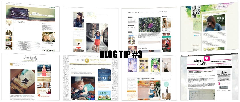
I was kind of surprised when I posted tip #1 and noticed that almost all the blogs I read have white backgrounds. Coincidence?
I think not.
See for yourself:
- Kendi Everyday
- The Daybook
- Jess Lively
- Writing Chapter Three
- Bleubird
- Mary Sievers CPA
- Little Tin Soldier
The most overwhelming design element on those blogs is all the white, which actually isn't overwhelming at all. I think one of the reasons this works well is because it lets the individual blog posts - the text and images - stand out. The header and sidebar(s) (which I like to call the "wrapper") give your eyes room to breathe, and the posts shine through.
We are embarrassed at how we've muddied up our own blog design. I can promise you that we're in the middle of a redesign that will make your experience here a whole lot better. That sort of thing really matters to us.
Are there exceptions? Of course. A few of my favorite exceptions are:
Those sites have a little more color, but they are still beautiful and simple. The point is that you shouldn't feel like you have to have an elaborate blog design before you start blogging. Some of the most popular bloggers have very simple blog templates, proving that a black, gray and white color scheme will do you just fine - and content is king.

